

Search Engine Optimization
Content Marketing
AI

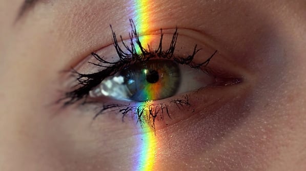
It’s no surprise to anyone that humans, deep down, are inherently visual creatures. We go about our lives focused on the task at hand, but the second we see a pretty picture, we’re inevitably doomed to distraction. The photo you clicked on to reach this article is a perfect example of that.
Display advertising is the method of using strategically placed visuals to lure your audience into fulfilling a specific action. In this case, our goal was to design an ad that would welcome and intrigue you enough to visit our website. There are so many different factors that come into play when you are designing your ad in the first place, so we want to provide you with every possible opportunity to find one that works for you.

Imagine you’re scrolling through your social media feed. At some point, you’ll see an ad from a new artist, whom you skip. How long did it take for you to make that decision? Precisely. In most cases, you have 2-3 seconds to create a lasting impact on your audience. It is, quietly frankly, the worst kind of speed dating… but there is a way to prevail if you know how to plan for it.
Now imagine you’re scrolling again. Eventually, another ad from that same same new artist pops up – only this time you pause. Something about it feels… different. As you take in the visuals, you feel interest rising. You feel good, perhaps even pleased at the sight of it… so you click on the link. This is precisely the effect that you want.
So, what was different? In the end, it all boils down to psychology. Since we are speaking in hypotheticals, it could have been any number of imagined scenarios… but there is one factor that we simply must highlight for you:
The psychological effects of color play a huge part in successful advertising.
Whether we like it or not, color plays an essential role in how we perceive the world around us. Display Ads are no exception. The spectrum of known color influences our behavior on a deeply subconscious level; every one of them having positive and negative connotations, depending on how they are used.
Since you only have 2-3 seconds to captivate your audience enough to consider becoming a customer, it is important to leave your audience with the right impression. And all that begins with connection.
Please remember that we are not recommending that you change your professional aesthetic. What we do want is for you to be mindful of how you might leverage the use of color in order to make stronger emotional connections when you publish those display ads.
As we said before, you have 2-3 seconds to capture the attention of your audience. That is an unfairly short period of time to show the world what you have to offer, but it can be done! Some colors clearly work better than others, so we’ll start will the most common of all.
Blue has a strong effect on the mind in general. It is most commonly associated with wisdom, strength, tradition, tranquility, trust, and conveys feelings of reliability. A large majority of established businesses use blue as their predominant color, and this is no surprise. If you choose to incorporate blue into your ads, you are aligning yourself with those factors whether you initially planned to or not.
Be mindful: Where blue is universally recognized as a calm and welcoming color, navy blue can have the opposite effect. Often associated with duty and professionalism, too much navy blue can also hold feelings of unapproachability, coldness, or a simply being devoid of emotion.
Red is one of the strongest colors, as it evokes strong emotion with ease. It is frequently associated with power, passion, boldness, and creates an immediate sense of urgency. But before you go painting this color on everything, we want you to take a moment to reflect on your audience first. Would those feelings attract or deter your customers? Does it pair well with the brand you have already established?
Be mindful: This color can signify anger and hostility. Similarly, dark red evokes feelings of urgency and action, which is why so many businesses use this color for their “Order Now” buttons. In the end, it all boils down to how, why, and when you choose to use these colors.
Yellow is an incredibly strong color. Frequently associated with sunshine, intensity, brightness, joy, and cheapness – it is the most common color when used to advertise sales and clearance prices.
Be mindful: On a deeply subconscious level, too much yellow can be abrasive and evoke feelings of fear and anxiety. You might see this in play when a furniture store is in the process of liquidating its inventory, as every room becomes a sea of yellow signs. This could be a strategic move to make customers feel anxious so they are inclined to buy “While Supplies Last,” but this does not have the same effect on online stores. Yellow, being such a strong and vibrant color, can prove draining on the eyes in a relatively short time, thereby forcing customers off of your page faster than they would have if yellow were only used as an accent.
Green is one of the most dominant colors in the natural world. It effortlessly conveys feelings of abundance, freshness, good health, rest, refreshment, security, and growth. The sight of it is usually pleasing to the eye and often used in ads catering to wellness, nutrition, and finance. This is no accident.
Be mindful: Dark green can blend in with the background a little too well. Not a bad thing necessarily, but it can convey feelings of boredom if not properly incorporated into your overall design.
Orange is most often associated with autumn and the sun, so it conveys strong feelings of excitement, enthusiasm, and warmth. It’s an energetic color, often used to draw attention, while also being associated with cheapness. This all depends on the context, of course, but worth noting if you are featuring much of this color in your advertisements.
Be mindful: Dark orange can convey frustration and anxiety. We recommend pairing it with other colors to counterbalance those feelings.
Purple is a color often associated with regality. It conveys feelings of power, nobility, luxury, and wisdom. It’s also the color of mystery and spirituality, which does not work for most markets. But, if paired well with other colors, purple can intrigue and allure your audience in a most compelling way.
Be mindful: Since purple is such a powerful color, too much of it can cause feelings of frustration and arrogance. If you are to use this color in a Display Ad specifically, do so with caution.
They may be polar opposites, but they are truly powerful colors! Black is most frequently associated with luxury, sophistication and substance, whereas white brings to mind a sleek, modern, and polished professionalism. They are also the hardest colors to execute properly.
Be mindful: If not approached correctly, the excessive use of black or white can leave your viewer feeling severely unimpressed. Too much black can leave your audience with feelings of coldness, oppression, unwelcoming, and even death. Too much white just looks lazy and poorly planned out.
Though we all speak the same language here, subtext and subconscious messaging is another matter entirely. With only 2-3 seconds to leave a positive impression on your audience, you deserve every chance to take an objective look at what you have, and all that begins with understanding the psychological effects of color in modern day marketing.
Simply put, your display ads will be a waste of money if your designs are scaring off your customers. If you are still unsure of what to do, try running an A/B Test so you can feel more secure comparing one color to another in an active ad campaign. We, here at Two Trees PPC, would love to take care of this for you. Until then, we look forward to going into more detail on the next steps with our next article: Retargeting Tactics and How to Use Them.
